Why use a Safe Zone Template?
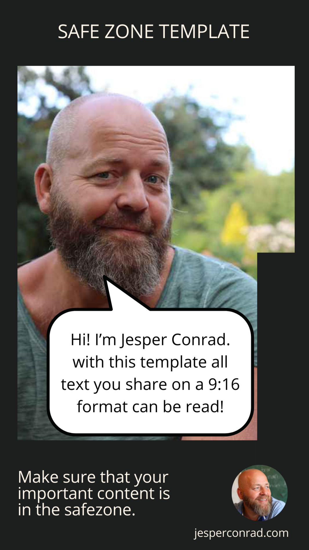
If you've ventured into the world of short-form video creation, you've probably run into a common frustration: the final product doesn't always look the way you envisioned. This usually boils down to a few persistent issues that affect the presentation of your videos:
- The presence of app icons along the right edge
- Descriptive text taking up space at the bottom
- Unused space at the top, a quirk of device formatting
- Important content being trimmed from the sides
These challenges are universal across platforms like TikTok, Instagram Reels, Facebook Reels, and YouTube Shorts. Individually, they might seem like small potatoes, but when they team up, they can significantly detract from your video's watchability.
These issues mainly interfere with two critical elements of your videos:
- Captions often find themselves entangled with icons or overshadowed by app text at the bottom.
- Screen shares or screenshots risk losing vital information to the infamous side crop, complicating comprehension.
I've use this template in my own projects, continually refining it based on my observations and needs. This template features transparency in the 'safe' zones, allowing for seamless integration with your video editing software.
Need Help With Your Marketing? Book a 25-minutes free discovery call
✔️ During the conversation, we'll get an overview of the challenges you're facing with your marketing.
✔️ We'll determine if I can solve your challenges.
✔️ I'll share my top 3 suggestions for what you can do right now to attract more clients.
✔️ Just to emphasize - our conversation is 100% non-committal - It's up to you to decide whether you want to continue working with me afterward.


